How to do mobile checkout optimization right
Nothing takes the shine off a shopping trip faster than a long line at the checkout.
Doesn’t matter if it’s food, clothing, electronics, or assorted shiny baubles. Finding that thing you absolutely had to have and then facing an extended wait to leave the store is dispiriting.
Have you ever just walked out in frustration? In bricks & mortar settings, it’s a frequent occurrence. In mobile shopping, it happens with alarming regularity.
E-commerce cart abandonment rates are massive — 75.6% across the board, according to SaleCycle. But mobile carts get left behind at a whopping rate of 86% (source: Barilliance). That means almost 9 out of every ten attempts to make a purchase with a smartphone ends without a sale.
It’s no surprise then that mobile conversion is much lower too — 1.82% for smartphones versus 3.9% for desktop (Monetate).
Are you tired of losing mobile shoppers at the last minute? Good news. When your optimize the mobile checkout process correctly, you’re able to convert shoppers at a much higher rate.
Let’s dive in to the mobile checkout best practices.
Why most mobile checkouts are wrong
Shoppers behave differently on mobile phones.
Yet, eCommerce and Retail brands don’t design their websites for that behaviour. Don’t get me wrong, I’m not saying it’s easy. Mobile behaviour is less forgiving and more impulsive, so it’s a harder crowd to please.
But the truth is, the majority of brands resize their websites for mobile screens and don’t add any extra functionality. The mobile purchase journey isn’t fully on-the-go. In other words: many mobile sites (and apps) don’t keep up with changing user behaviour on a shopping channel that evolves almost daily.
The result is the mobile equivalent of long lines at check out: customers just go.
That doesn’t mean you should just give up. On the contrary, mobile is now the primary source of web traffic to shopping sites, 65% against 35% from desktop PCs.
In other words, it’s almost three-quarters of your business.
There has to be a way to capture it, keep people engaged, then turn mobile visits into sales.
And there is.
We’ve gathered loads of best practice on mobile checkout optimization from our own client engagements and captured critical takeaways from the leading research.
We’ve got loads to tell you. If you don’t have time to digest it all right now, here’s a spoiler list:
- Unpick the final stages of your mobile sales pipeline to identify where customers are dropping off.
- Make customer buying behaviour more visible with technologies that enable better data capture.
- Use push notifications to remind customers about items still in their carts or cross-sell other products.
- Streamline the mobile checkout screens to minimize distractions and highlight essential elements like delivery dates and discounts.
- Design an order confirmation page and email that instills confidence and brings positive closure to the purchase experience.

Ready for a mobile checkout deep dive?
We’ve looked at everything the experts (our own included) have to say about mobile checkout best practice and distilled the pure stuff from the mixer. Here’s how to boost mobile checkout conversion rates and maximize mobile revenue opportunities.
First, know thy pipeline
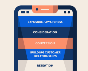
Pipeline analysis is an effective way to work out how well you’re converting mobile visitors to your mobile website or app, showing you exactly where and why you’re losing sales.
Once a mobile shopper has looked at a product page or added an item to their cart, they’ve officially placed themselves in your sales pipeline.
So you need to be able to capture the interaction whenever it occurs and then pinpoint where the bumps in the checkout process might be
The issues tend to break out around four key checkout functions:
- How easily you can add items to the cart
- What functions you can execute once the cart has been created
- How much data the customer needs to input manually
- Final order confirmation
Let’s look at each one in detail.

1. Decrease barriers and provide clarity
Mobile conversation begins long before the shopper arrives at the checkout screen. It starts the moment they arrive on your mobile website or mobile app. Conversion is the difference between passive browsing and motivating visitors to make a purchase.
Top tips: mobile website
If your mobile shopping presence depends on a mobile-responsive website, the options to improve the checkout process are limited somewhat by technology. But there are things you can do.
One is to ensure that there’s consistency between channels. If a shopper adds an item to their cart on the mobile website, they should also see it on the desktop website and vice versa.
Another is to provide fast feedback when an item gets added to the cart, so the customer can see it worked. Having a number overlaid on the page’s cart icon that reflects the number of items in the cart is one great way to do this.
Top tips: mobile shopping app
Make sure you eliminate last-minute surprises that end up killing a mobile app sale: learning late about extra shipping costs and taxes, for example, having to create a user account, or glitchy apps that lag, freeze, or display lots of error messages.
Inside your app, make costs and shipping times clearer in the early stage of the process, ideally upfront when products are being selected. To keep apps seamless and smooth, offer functions like social sign in or one-touch/touchless payment.
2. Feature-rich shopping cart interface
Once a shopper has selected the products they want to buy, they’ll want to see a detailed snapshot of the purchase after clicking the checkout button.
At a minimum, the shopping cart user interface (UI) must display all the products they’ve selected, with critical details like size and colour, ideally with a photo attached to each item for simple recognition. The total amount plus shipping costs is a no-brainer.
And that’s not all you can do.
Top tips: mobile website
- Make the mobile site shopping cart easy to update.
- Provide a ‘garbage can’ delete icon or simple ‘X’ for removing any item in the basket.
- Provide a simple drop down to enable users to easily adjust the number of items they want up or down.
Top tips: mobile shopping app
- Let shoppers edit item details like color and size within the app shopping cart itself.
- Offer a ‘save to wishlist’ option so you can prompt users to revisit the list later with a push notification.
- Let them easily save info to create an account so you can store it locally in the app and begin building a relationship with them.
3. Minimize manual data entry
It doesn’t take a lot to frustrate mobile shoppers. Ask them to do too much work, and you’ll lose them. Nearly half — 46% of all cart abandonment happens when users have to enter address and payment information. That makes manual data entry a top conversion killer blame.
On the upside, fixing your checkout flow could have a huge impact on mobile conversion.
So how can you grease the wheels and help customers fly through the final steps of mobile checkout?
Start by optimizing your mobile site checkout (see our tips below). That’s one area where shopping apps really deliver their ROI. They convert at 3x the rate of mobile sites for retail and ecommerce brands.
Part of this has to do with better, easier and more enjoyable experience and features. Think push notifications, AI and smart navigation. But a very big part is because of the advanced options for mobile checkouts. In-app, users can achieve purchases with one-click or even one touch.
Here’s our tips on minimizing the steps for checkout.

Top tips: mobile website
- Minimize long page scrolls by breaking up the checkout process.
- Use shorter pages to create the impression that shoppers are progressing quickly.
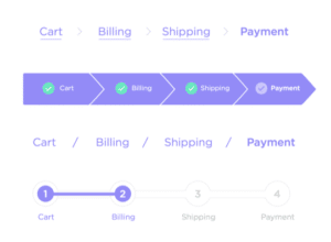
- Create a sense of momentum with breadcrumbs that display the number of pages still to complete.
Top tips: mobile shopping app
- Offer guest checkout in the app. Why? 30% of mobile users abandon their cart if forced to register at the start. But: do give them an option to save their info and create an account at the end. We’ll explain why below.
- Automatically display the app’s numeric keyboard for fields like credit card info and phone numbers.
- Offer easy one-touch payment through Apple Wallet, Amazon Pay, PayPal or Google.
Finally, for app users who’ve created an account and logged in, use auto-fill to populate address and payment details with simple options to change them without leaving the checkout screen.
Improve your mobile checkout
We’ve all done it, that thing you do when you’re at the grocery store, and there are multiple line-ups at multiple cash registers. You scan the queues and make a quick assessment about which one is moving fastest, right?
Get it right, and it’s pure joy. Get it wrong, and it’s frustrating, bad enough that you remember it, and maybe think twice about coming back!
With an m-commerce partner like JMango360, you can analyze your mobile sales funnel, understand the purchase journey your customers take, enhance your mobile-responsive website — or better yet, create a mobile shopping app that offers all the rich features and functions mobile shoppers demand.
Want to know more? Ask for a demo, or get in touch with us today.


