


Cart abandonment in ecommerce is a shocker. More than three-quarters of online purchases start, then end, without a sale.
But mobile shopping carts really get it in the neck. They’re abandoned at an alarming rate of 86%. That means 9 out of every ten attempts to make a purchase on a smartphone die on the vine.
It’s no surprise then that mobile conversion is low too. Numbers from Monetate peg conversion at 1.82% for smartphones versus 3.9% for desktop.
Why the gap? Mainly because shopping behavior on mobile is just different from the desktop variety. Mobile shoppers are typically on the go, working with smaller screens and thumbs rather than mouse and keyboard. That means the shopping experience has to be quick and fluid.

Most brands turn their desktop site into a mobile site without fully adapting it to the mobile experience. But don’t throw in the towel. Hideous levels of transaction drop-off are not inevitable.
Mobile phones are the number one source of web traffic to shopping sites, 65% versus 35% from PCs. And their share of overall web traffic keeps growing.
The truth is, you can treat those left-behind shopping carts as pent-up potential revenue.
You just need the right channel approach to release it.
In this blog, we’ll give you four tips to make your mobile ecommerce app, website, or both, a capture-and-convert machine.
How to improve your mobile conversion rate
Tip 1: Make checkout frictionless
It doesn’t take much to frustrate mobile shoppers. The instant gratification smartphones deliver has them spoiled for choice. The small screen and format of mobile user interfaces logically makes people less patient. They’re demanding and impatient by nature. Ask them to do too much work, and you’ll lose them.
Nearly half — 46% — of all cart abandonment happens when users have to enter address and payment information. So chalk-up manual data entry as one of mobile’s top conversion killers.
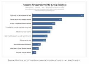
They don’t like 11th-hour surprises either. Finding out on the confirmation page that shipping costs and taxes are extra or that they’ll need to create an account can end a sale quickly.
Make conditions like taxes, duties, handling costs and expected shipping timelines clear upfront.
Once a shopper has selected the products they want to buy, they’ll want to see a detailed snapshot of the purchase after clicking the checkout button.
At a minimum, the shopping cart summary screen should display all the products they’ve selected, with critical details like size and colour, ideally with a photo of each item so they can double-check.
Then once they’ve decided to click yes, give them the option of one-touch/touchless payment.
Tip 2: Get faster
If your mobile commerce channel is the smartphone version of your website, you need to look again at your site’s mobile UX. That includes how quickly pages load and how responsive it is to actions taken at the user end.
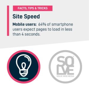
According to figures from Google, half of smartphone users (a bit more than half actually) will dump a mobile website if they have to wait longer than three seconds for it to load, and half of mobile visitors expect mobile website pages to load in less than two seconds.
That sets the UX bar pretty high. To help keep your site or app users happy, consider doing the following:
- If your images are sized for desktop display, the resolution is too dense for smartphones. You end up with massive files that slow down page loads and smoke megabytes of customer data. Optimize your images for mobile devices.
- Instead of relying on JavaScript queries (which aren’t always accurate), use server-side detection to identify the end user’s device make & model, OS, browser, screen size, and other metrics that can help you tailor the experience.
- Finally, analyze your site or app for image compression issues. Manually re-sizing images often gets you sub-optimal results. It’s better to use dynamic re-sizing techniques to automatically detect devices and shrink images accordingly.
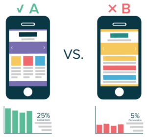
Tip 3: Make app and site navigation simple
It takes 3-4 seconds for the mind to process a line of text, but just 12 milliseconds to process a photo.
That’s why mobile navigation needs to be visual. You can use the brain’s tilt toward pictorial info by including category tree images and using gesture-based navigation — tapping and swiping — to help people move about naturally. In other words, don’t use the word ‘black’ as a colour option, show the colour black as a field/button.
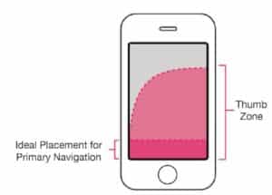
When your customers stare at tiny screens all day long, distraction-free navigation is critical. To boost conversion, brands need to give mobile shoppers a comfortable viewing experience and lead them gently by the nose from product selection to final sale.
You can do that with simple, elegant page layouts that reduce eye strain and colours and visuals that make for quick scanning.
Natural colours and simple layouts are less likely to overwhelm users, enabling them to look at your app for longer without getting antsy. Along with better visuals, build in a better experience.
Things that limit users freedom or narrow their options should be eliminated.
- Get rid of any minimum purchase thresholds and make checkout easy.
- Offering a one-touch purchase enables people to act on the buying impulse quickly before it disappears.
Read more on the current ecommerce app design trends here.
Tip 4: Use A/B testing to find out what works
If you really want to know what design and navigation elements turn visits into sales, try A/B testing your content.
Even a small change in your app’s UX can significantly impact conversion rates, so it’s essential to try different options and measure what gets the best response.
What is it? First, you segment an audience into at least two groupings, show each on a different set of functions, layouts, or visuals, and then capture how each option impacts user behaviour.
The great thing is you don’t have to split them up yourself, there are great tools out there to do it for you. All you have to do is create two different pages and implement a tool to run the test.
The famous mobile commerce brands use A/B testing every day to determine the best possible user experience and convert more browsers into shoppers. Test images, layouts, payment types, copy treatments, even emojis. The sky’s the limit!
Online retailer WallMonkeys juiced its conversion rate by 550% using A/B testing.
Try Google Optimize if you want to experiment with a free tool first. Then look at Optimizly once you’re feeling more confident.
Closing the conversion gap
Many brands think great websites are enough to hook today’s smartphone shoppers.
Your website may look great on a touch-screen, and effective SEO can pull in organic traffic, but can it convert them on its own?
It’s true that mobile web technology has come a long way, but when it’s time to make a purchase, user experience is its Achilles heel. Even the best mobile-responsive website can only offer limited ecommerce functionality when a customer wants to buy.
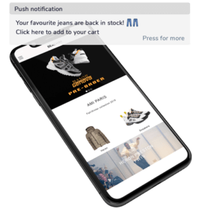
Augmenting your site with a mobile ecommerce app gives shoppers a seamless buying experience. Add a smart app banner to your mobile site and all your mobile visitors will automatically see the app’s clickable banner. eCommerce apps or progressive web apps will deliver the crucial mobile commerce capabilities at checkout we mentioned above:
- One-touch purchase,
- Saved customer profiles
- Push notifications
- Address and credit card autofill
These are all time-saving tools that make it easier for mobile shoppers to buy things quickly with taps and swipes.
Need help optimizing your mobile commerce presence? With our App Building Software, every ecommerce and retail brand can launch a premium mobile app of their own to drive mobile sales.
Say goodbye to expensive custom app development. Your app is uniquely designed and launched within 30 days, with all the out-of-the-box features you need against an affordable monthly subscription. Over the last 10 years, we’ve helped over +1000 brands grow. Get in touch today for a free consultation. You’ll be on your way to better conversion.


