


Anyone who bought something on a mobile phone can tell you that it’s a unique experience — nothing like shopping on a laptop or desktop PC.
There’s no mouse or physical keyboard, just a touch screen. The gestures you use are different, the journey from product selection to final purchase is different, the screen display is different, and entering information into a smartphone is very different indeed.
That means the strategy you adopt for attracting, engaging, and converting mobile shoppers is going to be different too. Any e-marketer looking to maximize mobile sales needs a channel approach that recognizes and accommodates mobile shoppers’ behaviour.
Smartphones are now an indispensable part of people’s daily lives, and they’ve transformed how we shop and act online. Most people reach for their mobile handset now when they want to search, get directions, read the news — and shop. It creates new opportunities for marketers to reach a constantly connected set of consumers.
So how do you leverage those opportunities? It starts with understanding.
First, some stats
- Shopping via mobile is quickly leaving desktop e-commerce behind. Marketers across categories are now treating mobile as their primary channel for online sales.
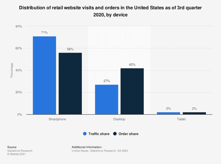
- Internet traffic from smartphones passed desktop by back in 2018 when it reached 52 per cent of global website visits. Since then, it’s consistently gone, beating desktop by 60 to 30 percent.
- For retailers, traffic from mobile devices is even more dominant – 64 per cent to desktop’s 29.
- 96% of smartphone owners use their devices to research products and services.
Under COVID lockdowns, consumers and businesses moved to e-commerce because they had little other choice. That gave a vast number of people their first taste of the ease and simplicity of buying online. They’re now catching up on the desktop-to-mobile shopping journey that early adopters have already made.
But mobile shopping means more than accessing websites on a smartphone…
Meet mobile shoppers where they live
It’s not enough to replicate your desktop web store on mobile. Being where customers are already at is essential, and increasingly they’re doing their shopping with apps.
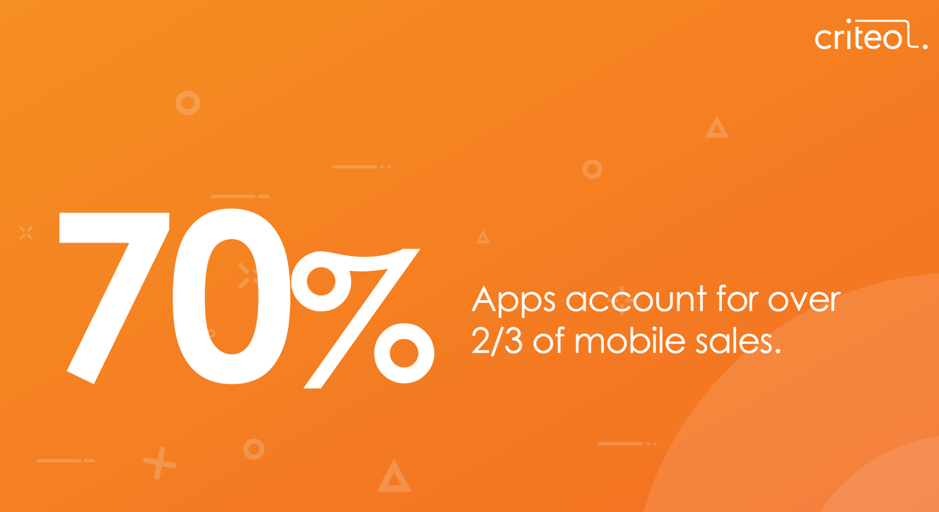
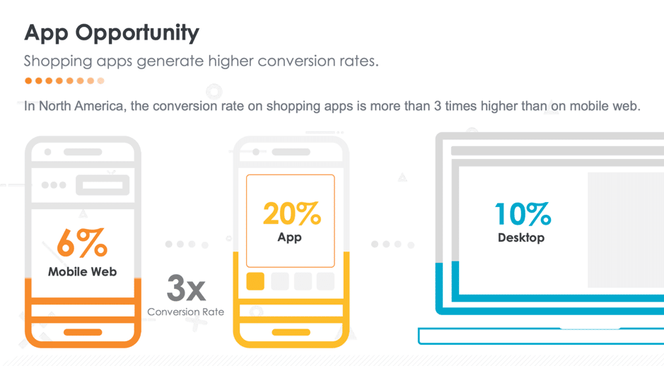
Mobile-responsive websites can be an essential part of the mobile channel mix, but mobile apps convert at a much higher rate – up to 3-times more.
They also increase loyalty. Users spend 90 percent of their smartphone time using apps, and they account for over 70 percent of mobile shopping transactions. Those trends extend across most of the world’s advanced mobile markets — America, Europe, and Asia-Pacific.
According to e-commerce analysts Criteo, any business selling online needs to make shopping apps a cornerstone of channel strategy. Otherwise, they risk leaving money and revenue opportunities untapped as mobile transactions extend beyond the limited capabilities of mobile websites.
Create shopping experiences that match mobile behaviour
So mobile is significant, meaningful, and different from desktop. Let’s dig into what that means for mobile e-commerce design.
People (still) hate typing on tiny screens
From tiny virtual keys to auto-complete errors and numerals that are hard to find, people have a lot of trouble with touchscreen typing. Handset manufacturers have tried to improve the experience with innovations like haptic feedback, but most users still shun it. They avoid typing altogether if they can. By storing critical information like login details, payment types, delivery addresses, and so on, apps make it easier to type less.
Sound matters
Most people leave their phone ringer on with the volume turned up. That’s because people like the instant gratification and sense of connectedness that app notifications provide. They also like the feeling of closure when a tone confirms that a message has been sent or read, money’s been received in a bank or trading account, and so on.
Delight mobile users if you want to keep them
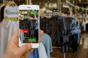
While everyone is concerned about data privacy, people also expect their phones to have all their personal information to hand, including their location. That enables the phone to do things like deliver push notifications based on location, recognize voices, apply augmented reality to a physical store, and more.
It’s the small and surprising things that can delight users and help turn them into buyers. Apps can use more of a phone’s built-in capabilities to do this.
Keep navigation at the top of the screen
There’s something about bottom-located menus that mobile users don’t like. While it suits phone geometry and makes it easier to type while holding the handset with one hand, ethnographic focus groups have shown that it puts people off. The eye wants to see menus at the upper left or right of the screen. Don’t fight it. All core top-line navigation bar options should be either on the main screen or in the navigation at the top of the page.
Icons can help — or hinder
We’ve written before about how icons can improve the user experience and make life easier for mobile shoppers. But icons can be a double-edged sword. If there are too many for people to keep track of, they may ignore them.
Among the best-understood icons are the X for close and the triangle for ‘play’ or ‘advance.’ People recognize these icons instantly for two reasons: they see them on every site they use, and they are almost always used to indicate the same thing. Even if the layout or graphic treatment varies, people still get it.
Four touchscreen gestures rule them all
Mobile shoppers try to do everything on their smartphones with gestures. Despite voice search slowly rising in popularity, at this stage, people are resistant to learning new forms of interacting with their devices.
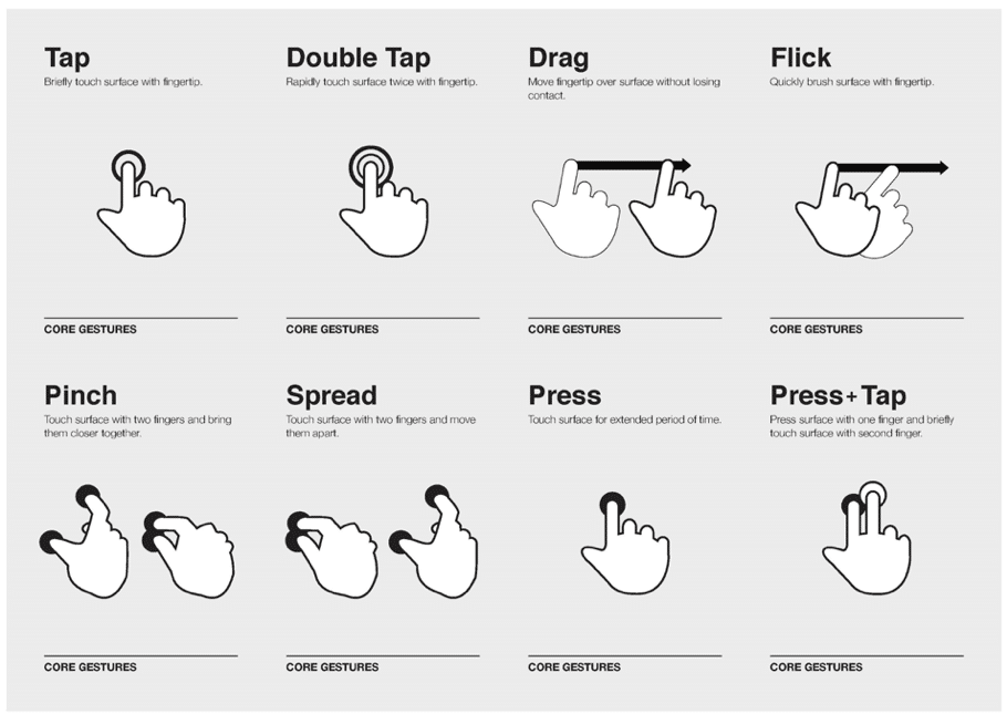
In short, they go with what they know. These four gestures dominate:
- The most frequently used gesture is vertical scrolling. People recognize it from desktop use, so it doesn’t require a visual cue to prompt users to take action. If no other clear option is available, people will attempt to scroll out of instinct.
- The popularity of social media apps and horizontal image carousels means people understand screen swiping and what it does. Like scrolling, users will often attempt it even without arrows or other visual cues.
- Tapping screens multiple times to take an action is also well understood but not as immediately familiar as swiping and scrolling. On a desktop PC screen, a user might repeatedly click on a link or button. On mobile, that happens less often. Tapping and mouse clicking aren’t the same.
- Screen pinching and zooming is another gesture people use, but infrequently. If a website’s display isn’t optimized for mobile, users will look for a link to the ‘proper’ mobile site rather than try to contract or expand their way across a page.
How to adapt to mobile behaviour
With a growing number of e-commerce users out there giving mobile shopping a try, you need to present your online offer in a way that makes finding and purchasing products easy.
Are you thinking about how to optimize your channel to address mobile shopping behaviour? We’d love to help. Check out JMango360’s solutions for maximizing mobile commerce results


